

Each check-in point has its own form. Open a check-in point from Check-in points to reach the designer, where you build the questions visitors answer and theme the page they see.
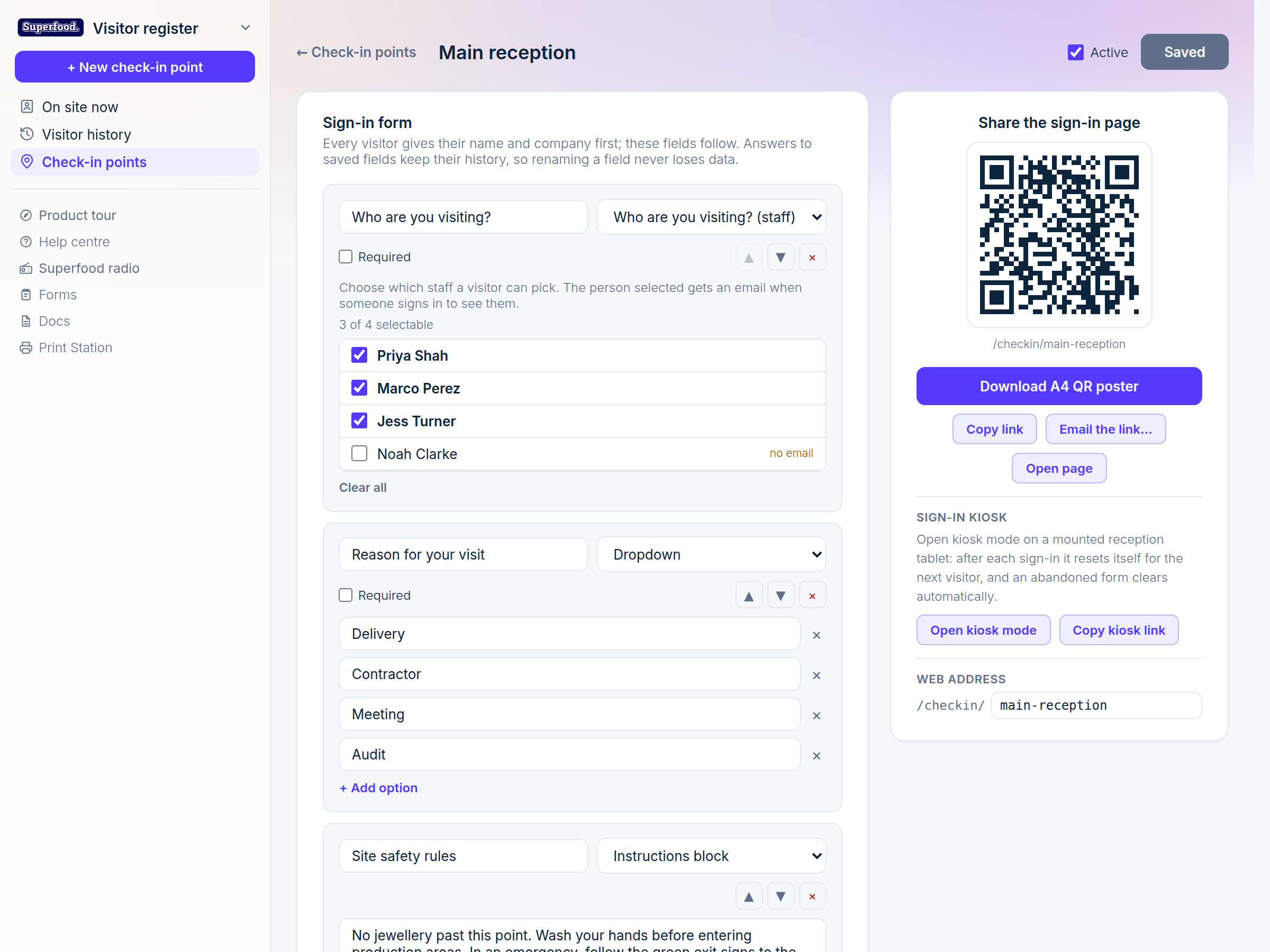
Every visitor is always asked their mobile number, name and company first. The fields you add follow those.
Adding and arranging fields
Use + Add a field at the bottom of the Sign-in form card to add a question.
Each field row has a label, a type, a Required toggle, and arrows to move it up or down. The × removes it.
Changes are not live until you click Save changes (top right). If you try to leave with unsaved changes, we will warn you first.
Renaming a field never loses data: answers are kept against the field even if you change its wording later.
Field types
Type | Use it for |
Who are you visiting? (staff) | A dropdown of staff. The person chosen gets emailed on arrival. |
Short answer / Long answer | Free text, like a purchase order number or notes. |
Dropdown | A fixed list of choices, like the reason for the visit. |
Yes / No | A simple declaration. |
Agreement tick | A box the visitor must tick to agree, for example to your site rules. |
Email / Phone | Extra contact details, validated as they type. |
Photo | A photo taken on the visitor's phone camera. |
Signature | A signature drawn with a finger. |
File upload | A document, like a contractor's insurance certificate. |
Instructions block | Not a question. A block of text visitors read, like your safety induction. |
Training question | A question with a correct answer. Visitors must get it right to sign in. |
Training questions
A training question is how you make sure a visitor has actually read your induction before they are allowed on site. Add a Training question field, type the question, list the answers, and tick the one that is correct. Add an optional explanation, shown when someone picks the wrong answer, to teach the right one.
A visitor who answers incorrectly cannot sign in until they choose the right answer. This is checked again on our side, so it cannot be skipped.
Theme the page
Below the form, set the accent colour, a welcome line, some intro text, and whether to show your company logo. This is what visitors see the moment they scan the QR code, so it is worth making it look like your business.